Ensure your SLAs are correct by visualizing data flow
Using Service Level Agreements
 If you’re a service provider you probably use Service Level Agreements (SLAs). You want to give your customers confidence that, should anything go wrong, your team will do their best to resolve it within a given time. You define a service level that you feel confident you can meet. Your customer can then plan around that SLA in case the worst happens.
What happens should you fail to restore the service within the period agreed? In many cases penalties and compensation come into play. These will form part of the SLA and act as an incentive to get things fixed well within the agreed time. Some customers may be losing significant amounts of money while your service is unavailable, they’ll want to try and recoup as much of that as possible.
Problems measuring SLA compliance
It surprised to me, then, to learn that SLAs are breached a good deal more often than you may think. And in many cases companies are not pursuing the compensation that they are due under the agreement. For one provider I worked with, the fact this happens was something of a relief. For around 40% of inbound calls we were unable to accurately and confidently calculate the correct SLA. It meant for these calls we didn’t even know if we had breached the SLA or not!
This exposed the company to a significant financial risk, the fact that many customers didn’t pursue compensation had left them complacent. All it would take is one reasonably high profile case and they would have seen a significant impact on brand and profit.
Root cause analysis
It wasn’t that they didn’t want to invest the time trying to fix it. It seems many people had tried to resolve the problem. Various change projects interfaced with this part of the business and all had tried to get to the bottom of why the SLA could not be accurately measured at the point where the customer called in.
I spoke to several people that had attempted this in the past. They had all got so far and had come at it from different angles but didn’t quite join up the dots. It appeared that most of the pieces of the jigsaw were there but it wasn’t clear how they fit together.
Creating a life cycle diagram
To investigate the issue we decided to treat the SLA like any other process and visualize the steps that it went through until a customer ended their contract. We created a lifecycle diagram of the SLA, from design through to completion.
Services are designed centrally and SLAs are defined by the Product Management team based on a typical implementation. These services are advertised and then sold to customers. Customers use the service and report problems and finally they would stop using the service and close the contract.
 We had a five step lifecycle diagram that formed the framework for our analysis. This was a simple diagram that was easy to review and confirm with the various teams involved. Next we took each of those steps and broke them down into more detail. We were now looking at how the SLA was communicated from one team to another by visualizing data flow.
Visualizing data flow
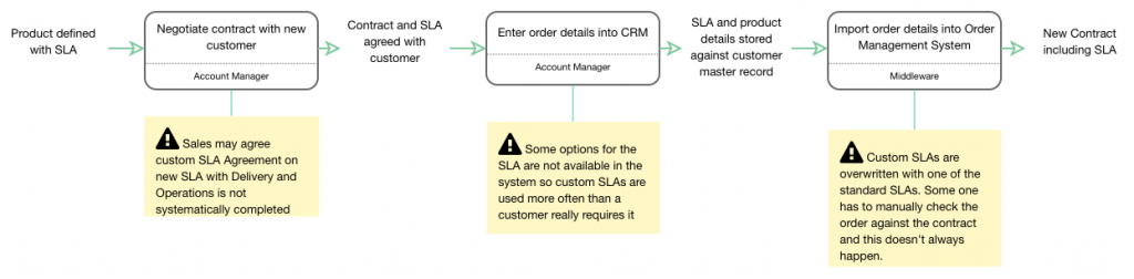
The SLA was documented and entered into the product catalogue. When a new customer came on board sometimes they negotiated different rules regarding the SLA. When the product was entered on to the order management system not all the SLA options were available so operators sometimes had to enter custom SLAs, if they remembered. That data was then imported into another system. The developers of that interface were unaware that customers may have agreed custom SLAs so these were often overwritten.
 As the process progressed we saw more and more if these types of issues. All the different conversations I had had started to fit together. As the SLA data was passed from one team to another there was a known issue. Each time this was dealt with by a manual workaround. Each individual team felt they could deal with this effectively using these workarounds.
Shared understanding
It wasn’t until we started to build the full lifecycle visualization that it became clear the extent of the problem. While the instances of an incorrect SLA being introduced at each individual point was low the fact that there were so many places this could happen had an amplifying effect. As a result, when the symptoms presented themselves at the point the customer called in, it was impossible to see a pattern in the data.
The visualization consisted of 6 fairly simple process flows (2 of which can be seen above). One for the high level view and 5 which each represented the 5 steps on the high level. Presenting it in this way meant that all the teams involved were able to easily see where they contributed to the issue. And more importantly gave them a framework on which to build a solution.
The solution was fairly simple but the changes required would have made no sense without the context of the overall picture provided by the visualization. It was easy to reach agreement on what needed to be fixed and how it would impact each team. All it needed was a simple structured visualization to bring everyone together to fix what could have been a very expensive problem indeed.
Creating a visualization like this in Skore is very easy. It’s just as easy to share securely with other team members and have them comment on the diagrams. This provides a single place that describes the flow that can be accessible to everyone.